Rudolph Christmas Lights
Rudolph Christmas Lights is a premium holiday lighting company serving the Greater Vancouver area. I built their brand identity and website from the ground up in 1.5 weeks.
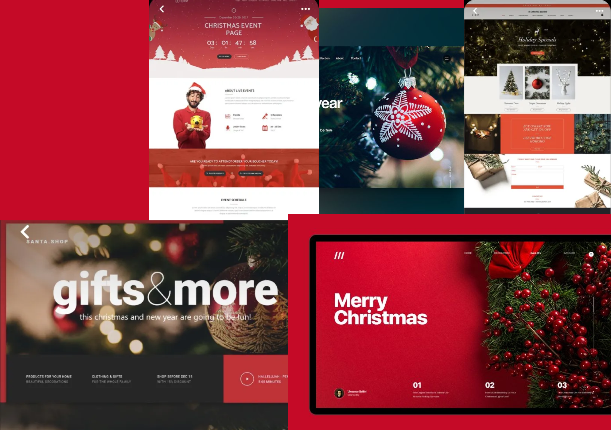
Complete Website Walkhrough
The Challenge: A Race Against Time
The client needed a quick website up and running, and I only had a week and a half to finish it. There was no existing name, no logo, and no content—just a service: "Christmas lights for commercial and residential purposes."
My challenge was to create a complete identity that reflected festive emotion and holiday charm while building immediate trust with new customers, all within an aggressive sprint.
Left: First Landing Page Iteration. Right: Initial Moodboard.
The Pivot to "Rudolph"
I presented the first iteration to the client, but he wanted it themed more specifically towards Rudolph the Red-Nosed Reindeer and use of more festive elements. This feedback was the turning point.
This led to my second iteration: a long-scrolling landing page structure, addressing his festive element with a bouquet of flowers in red and green which signifies Christmas colors. Other than that, I added dedicated pages for Residential and Commercial lighting to segment the user journey, and I began developing a custom logo that highlighted the famous reindeer.

Final Logo Design Iteration
Interaction & Navigation
To balance the festive aesthetic with usability, I implemented two key UX features:
1. Sticky Navigation
Given the long landing page structure, users needed complete freedom to switch contexts. I added a sticky nav bar ensuring "Residential", "Commercial", "About Us" and "Contact" were always one click away.
2. Parallax Storytelling
The client wanted "subtle yet visible animation." I added a parallax effect where a small bouquet of flowers in red and green floats upward as the user scrolls, creating a sense of vertical journey and delight without overwhelming the content.
Mobile Navigation
Standard hamburger menu for ease of use on small screens.
Parallax Animation
The floating light element creating depth during scroll.
Reflection & Growth
This project was a lesson in rapid decision-making. If I had more time, I would have advocated for more concise body copy, as the current text density can be overwhelming for users scanning for quick info.
I also realized that placing images above headings in certain sections disrupted the visual hierarchy. These are key takeaways I've carried forward: content structure is just as critical as visual flair.