Tapestry Book App
A memory-aid and social platform designed to reduce isolation among seniors aged 65+.
My Role
- UX Research
- UI Design
- Prototyping
- Interaction Design
Project Overview
- Timeline: 8 Weeks
- Team: Academic Project
- Tools: Figma, Protopie
Complete Mobile App Walkthrough
The Challenge: Redefining the Gallery App for Seniors
This project was completed for the Interface Design course at Simon Fraser University. Our design domain revolved around social isolation and loneliness among people within the same community or neighbourhood, specifically seniors over the age of 65.
The core mission of the app is to preserve precious community memories through visuals and supporting sounds. Our goal was to provide seniors with an immersive journey back in time, allowing them to relive their most cherished moments with all their senses.
Content Strategy
As a starting point, I suggested building a sitemap to visualize our app structure. This approach helped us narrow down the features applicable within our timeline and established a foundational structure for the application's look and feel.
Sitemap Summary:
Upon account creation, users can access My Gallery via the hamburger menu to share private pictures. The Community Gallery allows connection with neighbors through image viewing, liking, and commenting, and users can share their own images publicly.
Additionally, users can select songs from a playlist to align with specific photos, helping commemorate particular moments. Tapestry functions as a secure digital phone book, enabling peer connection while respecting personal privacy needs.
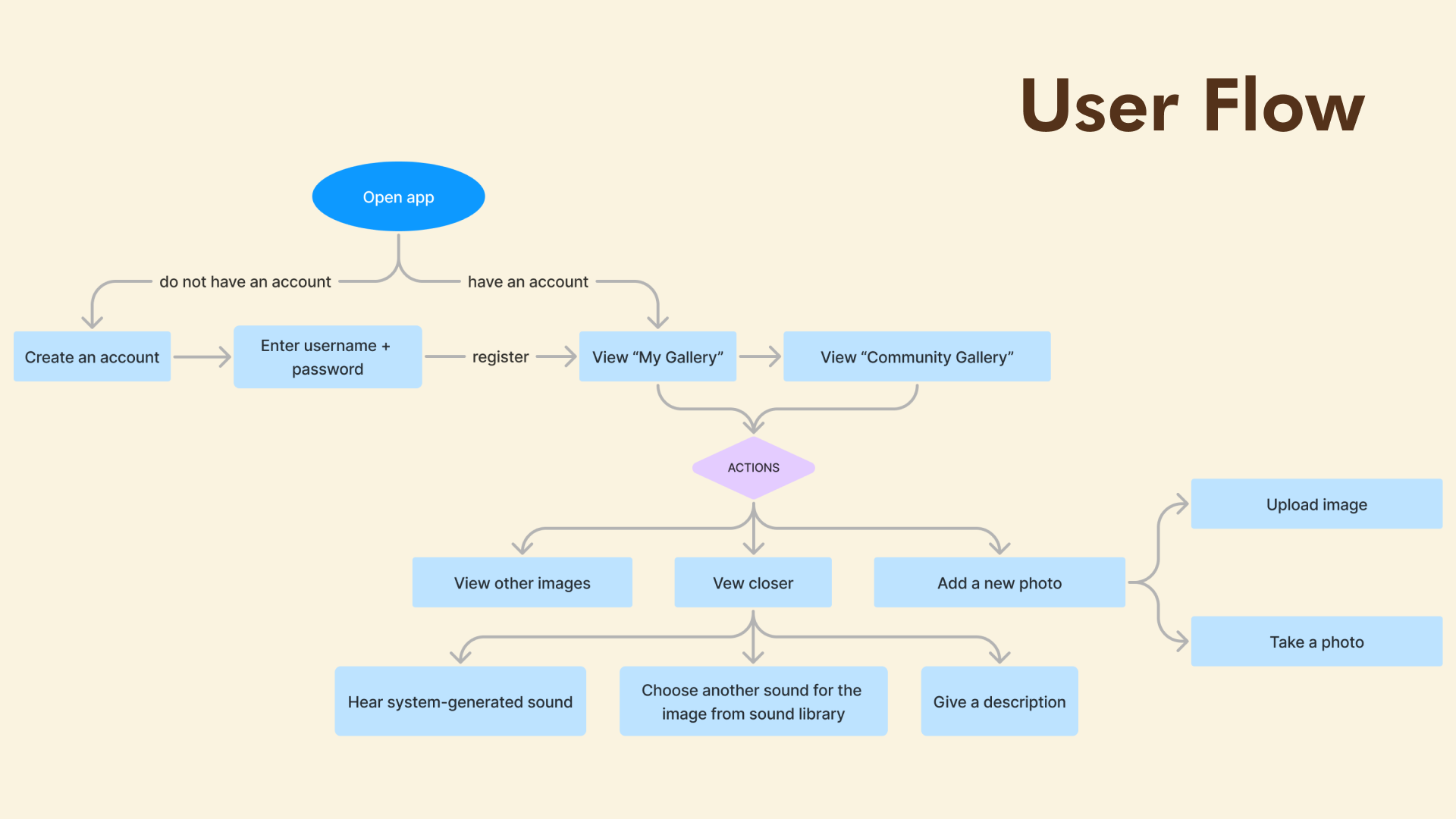
Sitemap Visualization: The foundation for user flow and content organization.
First Iteration
Mockup
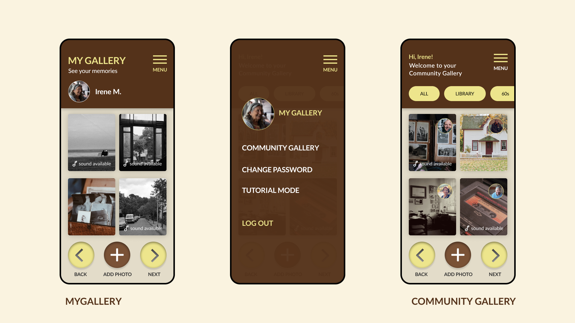
During the initial design process, I collaborated with my teammate, Valeriya Ten, to create the first mockup iterations for My Gallery and Community Gallery.
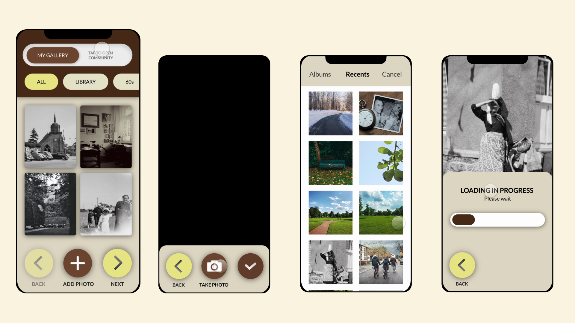
My Gallery
My Community Gallery
Post-Critique Feedback
Challenge
Our teaching team observed that the initial mockups didn't include sufficient interactive elements, which could result in users not engaging actively with the app, potentially affecting user retention. Additionally, they noted that the app might be unclear to new users, as it doesn't provide clear guidance or onboarding instructions on navigating the app or what steps to take after creating an account.
Design Interactions
Updated Design Interactions
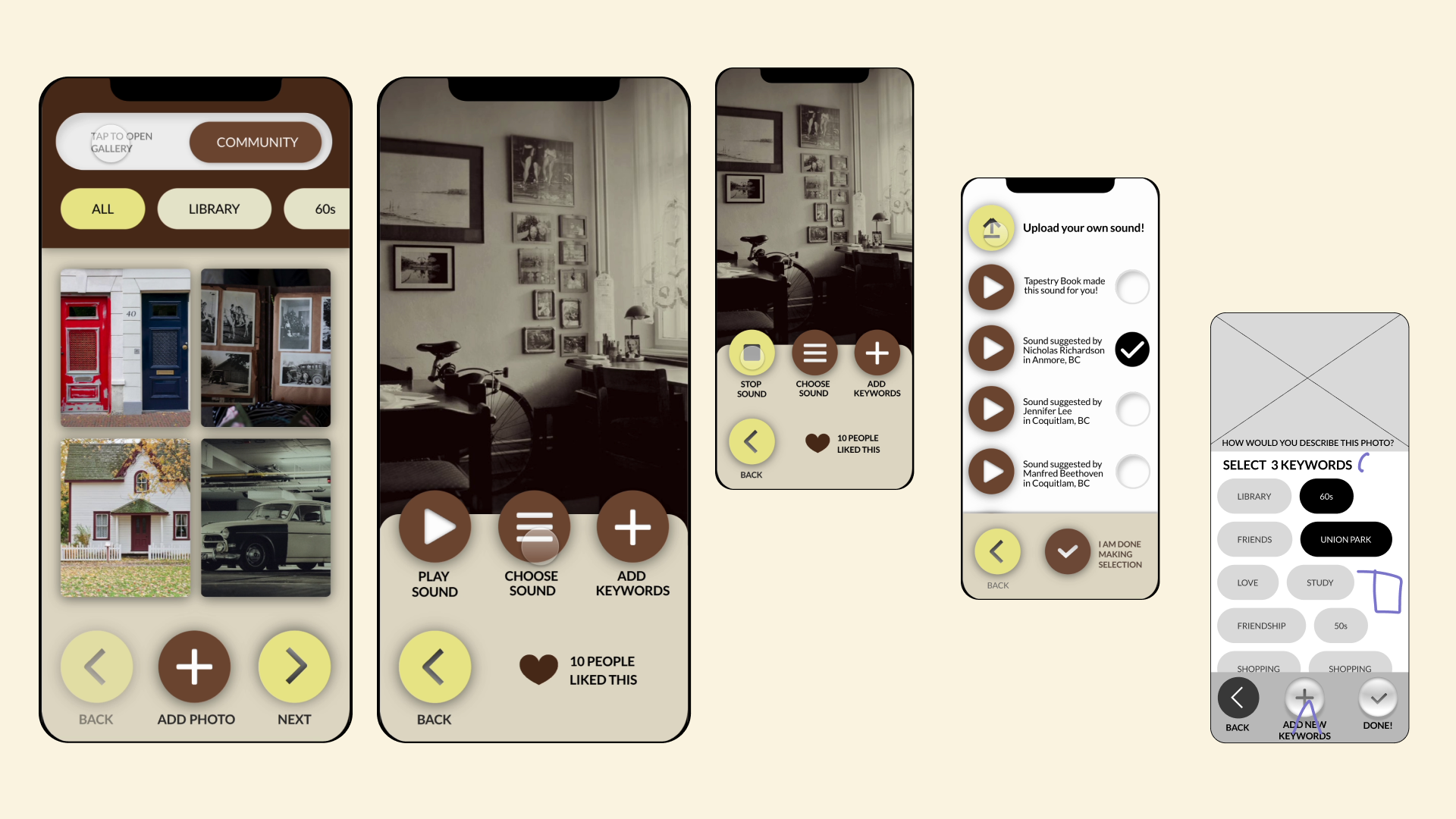
Following the critique, we implemented several key interface improvements to boost engagement and clarify the user journey.
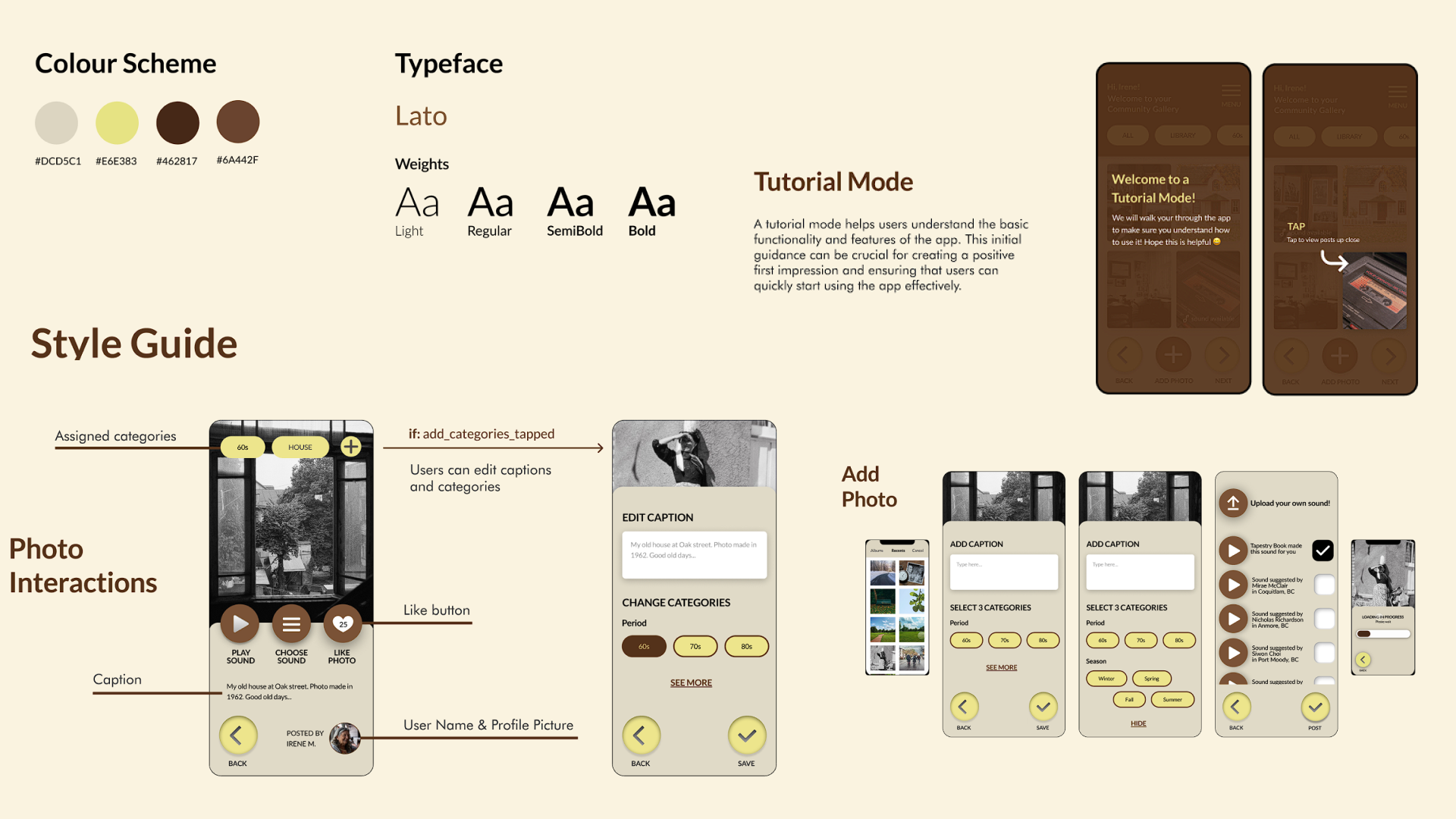
Core Interaction Refinements: I introduced a Tutorial Mode for new user onboarding, ensuring clear guidance on basic app functionalities. Photo interactions were significantly enhanced to include options for caption editing, categorization ("Period," "Season"), and thematic audio suggestions, which strengthen the memory-aid experience. Posts now feature user names and profile pictures, and Like buttons were added to drive community engagement.
Navigation & Layout: We made the Community Gallery the main landing page (replacing the previous toggle) to encourage active participation (Jae's focus). The My Gallery section is now conveniently accessible via the main menu (Valeriya's focus), providing a private space for profile and photo management.
Visual Design: Based on our research, I selected the final color scheme and typeface. The Lato typeface was chosen for its unique, quirky charm and readability, aligning with the app's overall friendly and accessible feel.
Design Interactions Updated
Final Design Mockups
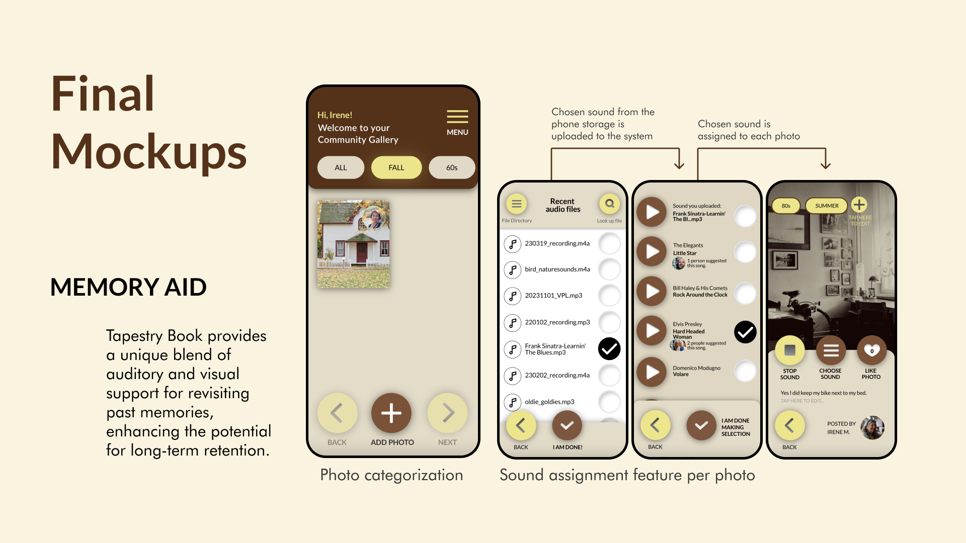
Final Design Mockups: Gallery, Logo, and Photo Customization.
Tutorial Mode Onboarding
Clear guidance designed for accessibility and confidence for first-time users.
Community Gallery Interaction
Showcasing the browse, sort, and like functionality for peer connection.
Reflection: Lessons Learned & Growth
This project provided me with valuable insights into the perspectives of seniors, particularly those aged 60 and above. It challenged my assumptions about design aesthetics, especially regarding the use of skeuomorphic elements, which our senior participants found intuitive and user-friendly.
However, we encountered challenges regarding cognitive load. Despite our efforts to simplify navigation with linear scene transitions, some participants found the app's steps unnecessarily complex. This experience underscored the necessity of balancing functional complexity with simplicity in the user journey, emphasizing the need for streamlined functionality.